How to Find Inspiration for Your Next Digital Planner Collection
More goes into an aesthetic digital planner than choosing colors, fonts, sections, and layouts. It's about ensuring it resonates with your audience, solves a problem they're experiencing, and fits your overall business strategy.
So instead of just creating every digital planner idea that comes to mind, inspiration for your next digital planner should be slightly more strategic. Before diving into creating a new digital planner collection, two areas of your brand need your attention first: your customer journey and your brand identity.
Let's talk about each of these in a bit more detail, then dive into different places you can find aesthetic inspiration for your next planner!
Outline your customer journey
Each planner you create should be built on a solution you provide to a problem your ideal customer is facing. To understand the problems of your audience, make sure you have a good idea of your niche. A niche is a specific group of people with unique needs that you're targeting with products customized to their lifestyle.
For example, we work with a lot of mothers. These mothers feel overwhelmed and disorganized. As a result, we offer a simple and portable digital planner that allows them to not only track their day-to-day tasks but organize doctor's appointments, meal planning, grocery lists, school assignments, finances, upcoming events, and more! This custom solution we know will help mothers feel more put together.
After you've created a solution-based product, try to predict the needs of your audience. You've solved one problem, so what comes next? When you have a product available that meets each of their needs, you create loyal customers who are constantly purchasing your digital products!
Let's consider another example of how this may look in an actual business. You create products for teachers and students. You've created an academic planner that will last your customers through the school year and helps them to organize their assignments and stop forgetting about deadlines. But what happens when summer comes? You've already solved one problem, so now you need to foresee the next! Teachers and students are likely going to take trips and enjoy their time off, so why not create a vacation planner? This will help teachers and students to manage their lives and organize their schedules even when they're not in school!
Outline a customer journey, then use the next stage of growth in your customers' lives as the theme for your next digital planner collection – you'll be setting yourself up for success!
Make sure you have a solid brand identity
Once you have a planner that solves a problem, you need to make sure it looks the part. This comes down to having a professional brand identity. What's included in a brand that turns heads?
Your logo - this is the face of your brand! Your logo should be clear, simple, professional, and convey your brand personality. It shouldn't just be full of your personal preferences, but it should also attract your target audience. Your logo is also the culmination of your font and color choices, so when you build a brand identity, make sure everything fits together for a consistent online presence!
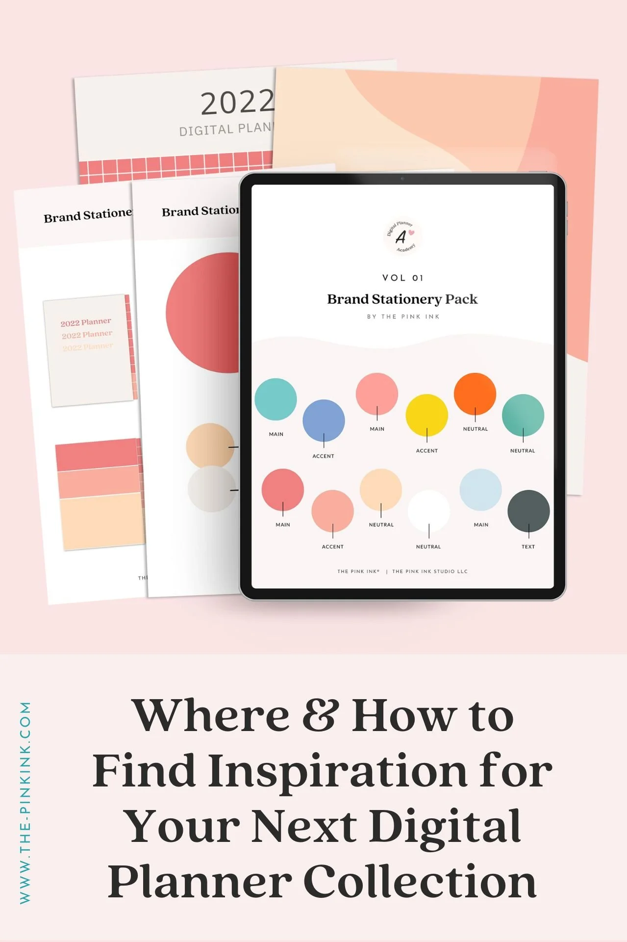
Color palette - while your logo is the face of your brand, your color palette is likely what you'll be using the most. Your colors are found on your website, on social media, and throughout your products. Your color palette should be the perfect blend of darks and lights, neutrals, and accent colors. It should include some of the favorite colors of your audience! For example, if you're marketing primarily to mothers, then you'll likely want to use feminine pastels and neutrals instead of bold, masculine colors.
Font choices - last but certainly not least, your brand identity should include specific fonts. Using only a few fonts helps you appear professional, build brand recognition, and stay consistent. We suggest finding one serif font, sans-serif font, and accent or script font. Three fonts allow you to break up headings, paragraphs of text, and calls to action to be easily distinguishable and nice to look at.
Your patterns, textures, and illustrations can all help build brand recognition and are part of a strategically designed brand presence. If you need visual inspiration for these elements of your brand, keep reading!
✨ Psst! Read our blog post all about branding your digital stationery business here!
Look for inspiration to make your planner unique
We want your planner to catch the eye of your audience, so where can we find ideas for stunning ideas? Inspiration can be all around you. Let's talk about 5 different sources of inspiration...
1. Pinterest
This is a digital gold mine for inspiration – find everything from intricate architecture to brand identities. Even inspiration from home decor to nature photography! When using Pinterest, be careful not to only look for inspiration within your niche. While it is a great resource, it can also cramp your creative style and lead to copy-cat products instead of one-of-a-kind digital planners. Follow The Pink Ink on Pinterest here!
2. The Seasons
Do you come out with a digital planner collection once every quarter? Each quarter roughly lines up with a new season – so why not model the aesthetics of your collections after spring, summer, fall, and winter? Each season can also represent a different stage in life and include a 90-day plan that allows your customers to break their goals into bite-size chunks and increase their overall productivity!
3. Your Audience
Our target audience already has the best idea of what they're looking for in a planner. When you take their advice, you may increase your sales! When we are in a creative slump, sometimes asking for help is just what we need to get the ideas flowing again. Add a question box to your next Instagram Story and ask them what features they would like to see in a future planner, their current struggles with digital planning, and what aesthetic they are the most drawn to. Your audience will greatly appreciate seeing how much your opinion matters to them!
✨ Download our free digital planner that will help you hone in on your niche
4. Nature
Take a minute to look around you – what color palettes do you see in nature? What shapes? Patterns? Textures? The natural world is one of the greatest sources of inspiration, and you don't even have to go very far or look too hard to find something that sparks your interest! Think about your favorite place to visit – what colors come to mind? This can be a great starting point for your next planner – especially if it's related to travel in any way!
5. Your Own Routines
Do you have a signature method that you share with your audience? Do they love following along with your day-in-the-life content? Use your own productivity methods as inspiration for your next planner. Adding a personal touch to your products makes them that much more human. When someone sees that this helps you stay organized each day and live a happy life, then they'll be motivated to purchase your planner and try it out for themselves!
Final Thoughts
Are you ready to build your next planner without hitting a creative wall? Follow these three steps, and you’ll have a new collection in the blink of an eye! So much more than a pretty cover goes into a well-design digital planner collection. We'll teach you all the strategies you need to know to successfully launch your digital stationery collection in our signature program, Digital Planner Academy®.
The strategies we teach will allow you to launch your digital collection strategically, make consistent sales without feeling overwhelmed, and design and sell your first digital planner in just two weeks.


