The New Era of Digital Planning: Why Minimalist, App-Like Designs Are Taking Over
Over the past decade, digital calendars and planners have taken over the market in comparison to traditional versions. Gone are the days of clunky desktop software with endless menus and options to sort through. These designs were created for an analog world and don’t translate well to the digital space. Now, a new wave of minimalist, app-like planning tools are taking over and changing how we organize our lives.
With streamlined interfaces, simplified features, and an emphasis on automation, these next-generation planners make scheduling and managing your time more intuitive than ever before. These planners adopt a clean, uncluttered interface that focuses on simplicity. The best minimal planners help you plan efficiently without feeling overwhelmed, as they guide you to record the most important details and commitments.
These planners prove that less really can be more when it comes to productivity and peace of mind. Today, we’ll be looking at why app-like designs are the new era and why you should implement these designs in your own planner business. There are always new ways to upgrade your business, and some are easier than you may think.
The Evolution of Planner Designs
The planner industry has come a long way considering that not too long ago, physical planners were the trend. Now, minimalistic digital designs are taking over the market. Digital planners started as PDF versions of physical planners that you could print out or view on a tablet, but soon planner apps emerged, providing even more convenience.
From there, a new wave of planners has arrived with simplified, app-inspired designs. These minimalistic planners ditch the unnecessaries add-ons and focus on a simple, intuitive interface with an app-like design.
They feature:
Clean, modern aesthetics with more negative space
Simple navigation and menus
Task lists, calendars, and schedules rather than detailed hourly layouts
Syncing across devices for location convenience
Integrations with other apps to automatically log information
The planner industry continues to adapt to new technologies and lifestyles. With simplified, app-inspired designs, digital planners are easy to use, easy to access, and perfectly suited for today’s on-the-go world. The era of minimalist digital planning is here.
The Case for App-Like Digital Planner Designs
Minimalist digital planner designs are appealing and beneficial for several reasons including simplicity, ease of use, accessibility, affordability. It could be a smart business move for digital designers to shift to these types of designs. Here are a few of the stand-out advantages.
1. Improved User Experience
An app-like interface allows users to find what they need quickly and efficiently without getting distracted by unnecessary elements. The learning curve is nearly non-existent as the simple layout is often easy to figure out. You can dive in and get straight to planning! Everything is also visually organized and labeled clearly, with the most important tools and features being prominently displayed so you can find them effortlessly.
Other than ease-of-use, app-like planners are built around logical workflows and a streamlined flow. The layout guides you through each step in an orderly progression that helps keep you on track. With an efficient flow and intuitive navigation, the overall process feels straightforward and enhances creativity and productivity.
2. Increased Flexibility
Unlike the rigid paper planners of the past, these streamline systems can adapt to your unique needs and preferences with increased flexibility and customization. To increase the personalization aspect, simply add your favorite stickers, photos, or art. App-like planners make it easy to upload images and other elements so you can create a planner that suits your style.
Digital planners also incorporate useful features like calendars, to-do lists, habit trackers, and note sections without appearing cluttered or overwhelming. You get all the functionality of a robust planner in an easy-to-navigate, distraction-free interface. Add or remove what’s needed and focus on what matters most to achieve your productivity goals instead of getting lost in the design.
3. The Appeal of Minimalism
Digital planners aim to provide an experience optimized for mobile and web, so unnecessary design elements are stripped away, leaving a sleek, modern aesthetic that is visually calming. By removing skeuomorphic design elements, such as faux leather textures, real paper-like pages, and heavy use of drop shadow, the planner will look altogether sleeker and more modern. Design planners that mimic physical planners can easily become distracting and overwhelming. Less is truly more, especially in a planner design.
Furthermore, with fewer distractions, the planner becomes more functional. The minimalist design gets distractions out of your way so you can quickly navigate to schedules, tasks, notes, or whatever else you need. Clean layouts also adapt well to smaller mobile screens where too many elements may feel cramped and cluttered.
👉 Learn about how to design an App-like Digital Planner here
Anatomy of an App-Like Digital Planner
We already know that app-like designs follow a modern, minimalist look, but what are the specific elements and features you will find in one of these planners? Let’s take a look!
1. Feature Breakdown
The hallmark of an app-like digital planner is its simplicity. They’re known for clean navigation with their simple sidebar that leads to each section. Some planners also use swiping gestures, like on a smartphone, to swiftly move between areas. Overall, the features are designed to be intuitive with features like clickable checkboxes, drag and drop task sort, and collapsible sections that are modeled after popular apps.
App-like digital planners are also built for adaptability, meaning the dashboard and UI design is based on your IOS style. The flexibility to adapt the planner to your planning style and preferences is key, and an app-like tool molds to you rather than forcing you into a one-size-fits-all solution.
2.Design Elements
To achieve an app-like minimalist design in your digital planner, focus on a few core elements:
Buttons Instead of Tabs: Buttons are cleaner, more modern, and minimize wasted space. They also allow for simple “tap and go” navigation on mobile devices.
Icons Over Images: Replace decorative images with simple icons that take up less space and serve the same purpose.
Embrace White Space: White space makes a design look clean and uncluttered, so add padding around buttons, headings, and sections.
Opt for Plain, Not Fancy: Avoid heavy drop shadows, textures, gradients, and shading, and stick to solid colors and simple geometric shapes.
Digital Over Physical: Forget the rings and spirals of physical planners. A digital planner has a flexible, resizable layout.
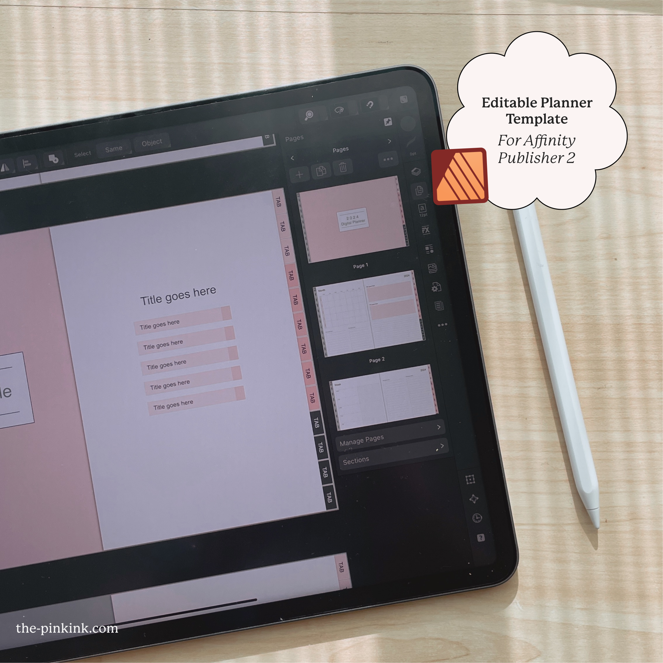
To achieve these elements, use Affinity Publisher to easily create a simple and clean design. The program’s tools are easy to learn and use, with minimal effort needed to reach your desired look. To learn how to use Affinity Publisher, join The Pink Ink’s Digital Planner Design Mastery course, which will help you design a minimalistic planner with these elements using Affinity Publisher.
3. Screenshots and Examples
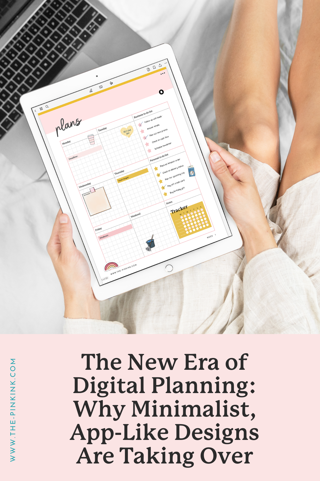
Clean, simple designs as shown in these examples put the focus on your tasks and schedule instead of on unneeded additions. Here are a few of our favorite minimalist planners that have been created using Affinity Publisher.
Example 1:
This Affinity Publisher template is a great view of a minimal, uncluttered planner. A simple list of tasks keeps things focused, and adding icons, due dates, and priority levels keeps things focused. For many, a straightforward list is what’s needed to stay on track.
Example 2:
A clean layout, consistent color-coding, and minimal distractions make it easy to follow important events and deadlines. For people struggling with “analysis paralysis”, less is more.
Making the Shift: Transitioning to App-Like Digital Planner Designs
Making the transition to app-like digital planner designs is easier than you might think– at least easier than going over-the-top with design. Simply start with a clean layout, add the basic interactive elements like clickable checkboxes, collapsible sections, and smart search, and then continuously upgrade and improve it over time.
We go more in-depth on the feature additions and design in our step-by-step Digital Planner Design Mastery course. In this guide, you’ll use Affinity Publisher to design an app-like planner that’s guaranteed traction. No worries if you don’t have experience with design– we’ll be right beside you throughout the whole process!
Overcoming the Challenges
The shift to minimal digital planners can be an adjustment for many designers and their clients. Here are some tips to help make the transition smooth:
If You’re Lost on Where to Start…
Use templates. Using pre-designed templates can minimize the learning curve. Look for templates with a simple, uncluttered layout and clean typography. These provide a framework so you can focus on customizing the content and styling. The Digital Planner Design Mastery course includes templates to get you started.
If You’re Not Sure What to Add…
Focus on functionality and keep the end user in mind. Ask yourself what they need to plan and track, and then add elements that streamline their workflow like task lists, schedules, trackers, and habit builders.
If You Don’t Have Ideas for Your Planner…
Start by moodboarding. In our Digital Planner Design Mastery course, our design experts will help you gather ideas and moodboard. We’ll work with you even beyond the idea creation though, up until you’re designing, testing, and selling your product.
If You Lack Support and a Community…
Check out the Digital Planner Mastery Course, where like-minded designers support and encourage each other in the process of creating digital planners. You will also learn tips from professional designers who have already created their own planners. It’s a great way to stay accountable and create the best planner possible.
👉 Learn about how to design an App-like Digital Planner here
Explore and Embrace App-Like Designs
The shift to minimalistic, app-like digital planners is here to stay. As technology improves, the line between physical and digital continues to blur, with digital capabilities standing out. Rather than rigid templates trying to mimic paper planners, the new generation of digital planners are simple, minimal, and intuitive. They focus on giving you the basics to plan your day without the clutter of paper planner replicas.
With so many benefits that make app-like designs stand out, it’s a wise choice to explore this upcoming trend in the market. To stay progressive and ahead of competition, it’s important to understand what is best for you and your audience. Minimalistic planners increase productivity and creativity by stripping away the unnecessary and focusing on what’s important.
If you’re interested in upleveling your business with app-like planners, join The Pink Ink’s Digital Planner Design Mastery course. Through the course, you can master any type of design with easy-to-use tools and guidance from mentors. Work peers and mentors to grow your business with a new type of design.


