Print-Ready vs. iPad-Ready: How to Get Your Planner Files Right
Your planner is designed. It looks beautiful on your screen. The colors are just right, the pages flow seamlessly, and you can't wait to share it with your customers. But before you hit "publish" or send it off to print, there's one important question to ask: is it actually ready for the format you're creating?
A planner that's ready to print isn't necessarily ready to sell digitally—and vice versa. Taking a few extra minutes to prepare the correct version now can save you time, frustration, and unexpected issues later.
I see this happen all the time. A designer creates something beautiful in RGB on a computer screen, hands it over, and then the brand owner is shocked when the print version comes back looking completely different. The colors are duller. The text looks a little fuzzy. There are weird white borders on the edges.
The truth is, a print-ready planner file and a screen-ready planner file are two different products. They need different color modes, different resolutions, different file structures. Now if you're planning to offer both print and digital versions of your planner, you actually need two separate sets of files.
In this blog post, we’re going to break down what is needed to make a design ready for both screens and physical pages.
What Makes a File Print-Ready
When you send a file to a printer, it needs to be set up in a very specific way. This isn't the printer being picky — it's about ensuring your planner prints exactly as you designed it so that you give your users the best experience possible.
CMYK Color Mode: For the color of your design to look the same on screen as it does in print, it needs to be set up in CMYK (Cyan, Magenta, Yellow, Key/Black). Screens create color by glowing with red, green, and blue light (RGB). Printers create color by mixing physical inks. When you send an RGB file to a printer, the color conversion happens at the last second — and you have no control over how it converts. Your beautiful navy blue might come back as a muddy purple. By converting to CMYK yourself before sending to print, you control that conversion and will know exactly how colors will look when brought to life!
300 DPI (Dots Per Inch): Colors are only one part of making sure your design looks the same on screen as it does when it’s printed. You also need to ensure your file is set to 300 DPI, meaning that there are 300 pixels of information in every inch of your design. At 300 DPI, the image is crisp and sharp. Anything less will look blurry or pixelated when printed. Your beautiful typography will have rough edges.
Bleed: To be safe, it’s suggested that you add an extra 0.125 inches of artwork on every edge of your design that extends beyond the trim line. When the printer cuts your planner after printing, the cutting isn't perfectly precise. With bleed, any artwork that needs to go all the way to the edge extends beyond where it will be cut so you don't see any white edges.
Crop Marks: Once you've added bleed to your design, you'll also need to include crop marks. These are small lines that appear just outside your page (typically 0.125 inches beyond the trim size) and show the printer exactly where the finished edges of your planner should be. Without them, the printer doesn't have a clear guide for where to trim your pages. Combined with bleed, crop marks help ensure every page is cut accurately, giving your planner clean, professional-looking edges.
Trim Size & Safe Zone: Once your trim size is set, keep all important content—like text, logos, and key design elements—at least 0.125 inches inside the trim line. This area is called the safe zone. Because printers can't cut every page with perfect precision, anything placed too close to the edge could be trimmed off. Keeping your most important content within the safe zone helps ensure nothing gets accidentally cut and your finished planner looks polished and professional.
Embedded Fonts: Before exporting your PDF, make sure all of the fonts you've used are embedded in the file. Embedding fonts ensures your printer can see and print your typography exactly as you designed it—even if those fonts aren't installed on their computer. Without embedded fonts, the printing software may substitute a different typeface, changing the look, spacing, and formatting of your planner in ways you never intended.
DOWNLOAD THE CHECKLIST »
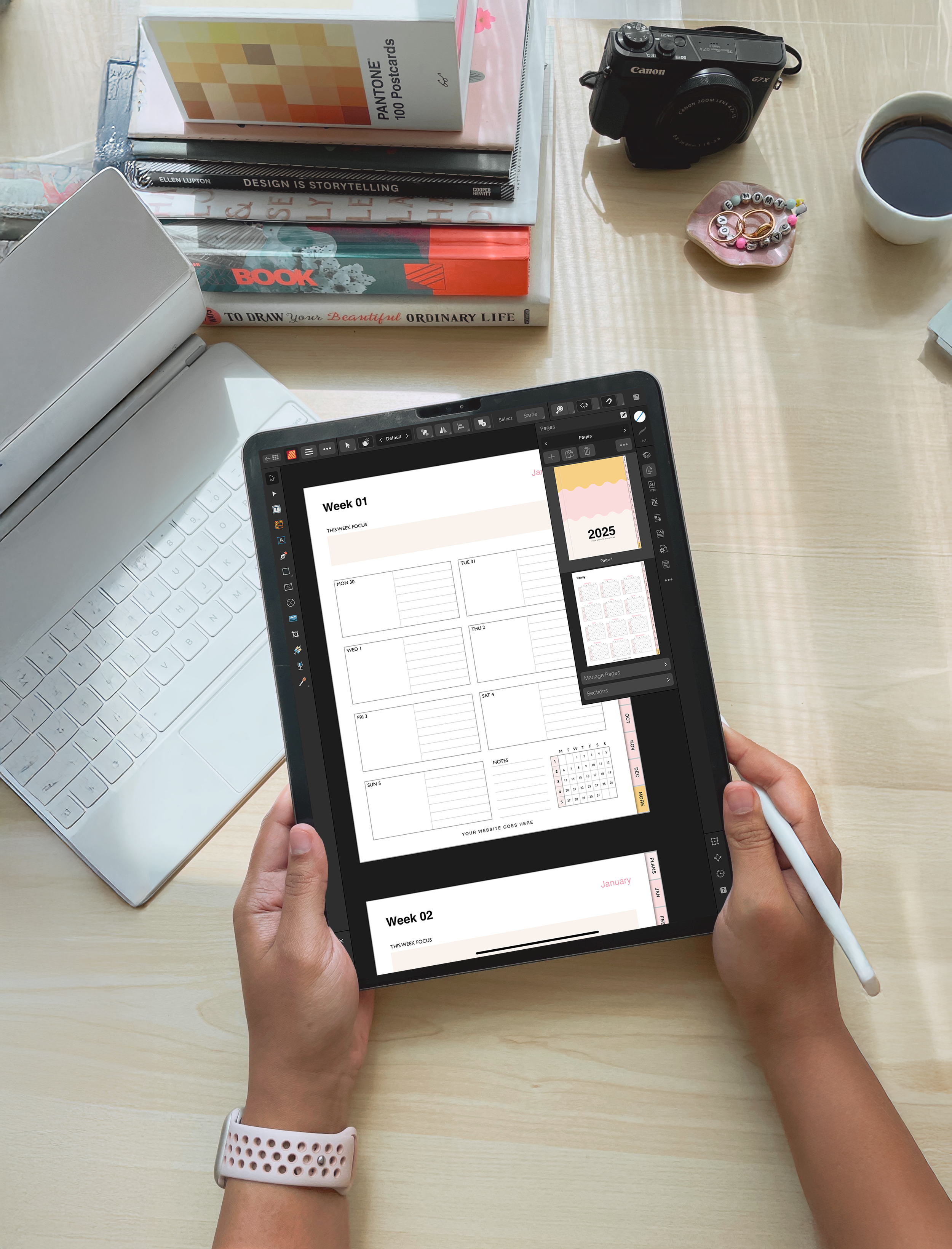
What Makes a File iPad-Ready
Here’s where things get complicated: all these standards change when you create a design that will be used exclusively on screens. Here’s what you need to know to set the correct parameters for a digital file:
RGB Color Mode: Be sure your digital planner is set up in RGB (Red, Green, Blue) color mode before exporting. Unlike printers, screens create color using light, so RGB allows you to take advantage of the full range of vibrant colors that tablets, phones, and computers can display. If you accidentally export your digital planner in CMYK, the colors may appear dull or muted on screen.
150 DPI: For digital planners, you don't need the high resolution required for print. A resolution of 150 DPI provides crisp, clear pages on most tablets and computer screens while keeping the file size manageable. This means your planner looks great without creating unnecessarily large files that take longer for customers to download and open.
No Bleed or Crop Marks: Since digital planners aren't physically printed or trimmed, you don't need to include bleed or crop marks. Your pages should end exactly at the finished trim size, creating a clean file that's ready to use on a digital device without any unneeded printing guides.
Hyperlinks & Navigation: Before sharing your digital planner, make sure every tab, button, and navigation element is properly hyperlinked—and test each one to confirm it works as expected. Smooth navigation is one of the biggest advantages to a digital planner, allowing users to jump between sections with a single tap. Taking the time to test your links creates a seamless experience your customers will appreciate.
PDF Optimization: Before exporting your final file, optimize your PDF to balance image quality with file size. You want your planner to look sharp while remaining easy to download, store, and open on a variety of devices. While the ideal file size will vary depending on your page count and graphics, many digital planners fall somewhere between 20–50 MB. Finding the right balance helps create a smoother experience for your customers from day one.
Binding Options for Notebooks and Journals
Once you've chosen the right size, it's time to think about binding. The binding you choose influences both the user experience and the production process, so it's worth taking the time to find the option that's the best fit for your product:
Perfect Binding: Pages are glued to the spine, creating a clean, professional finish that's commonly used for journals and premium notebooks. It works well for products with 80 or more pages, although it doesn't lay completely flat when open. Production costs are generally moderate.
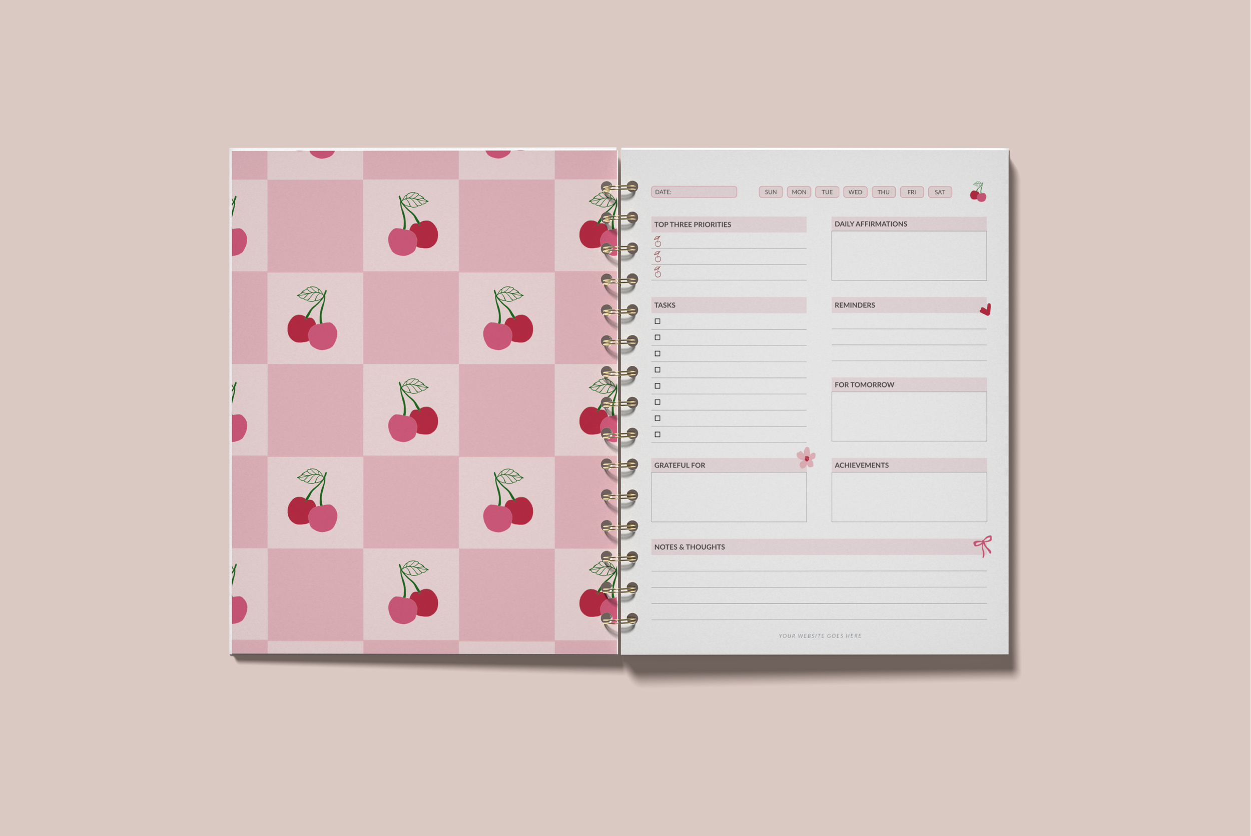
Wire-O (Spiral) Binding: Metal coils are threaded through the spine, allowing the notebook to lay completely flat for a more functional writing experience. This binding is commonly used for workbooks and guided materials, though it typically has a less premium appearance and costs more than perfect binding.
Saddle Stitch Binding: Pages are folded and secured with staples along the center fold, making it an affordable option for notebooks under 60 pages. It lays flat when open and is a great choice for thinner products like gratitude journals, booklets, and simple guided notebooks.
Coptic Binding: Pages are hand-sewn with exposed stitching along the spine, creating a distinctive handcrafted look and a premium user experience. It lays flat when open, offers a completely custom aesthetic, and is best suited for luxury journals or art books, though it is typically the most expensive binding option.
For most branded journals and notebooks, I recommend perfect binding. It feels finished, premium, and professional. Wire-O works if a flat laying product is critical to your user experience.
💌 Interested in working with The Pink Ink to create your custom planner or journal?
Fill out an inquiry form to start the conversation, share your project details, and help me determine if we’re a good fit for each other.
The Best Part? You Don't Have to Figure It All Out Yourself
By now, you've seen that creating a beautiful planner is only half the job. Making sure it's properly prepared for print, digital, or both is just as important—but it's also one less thing you have to worry about when we work together.
When I deliver your planner, you receive more than a beautiful design. You receive files that are professionally prepared for the way you plan to sell them, so you can launch with confidence.
If you're doing a print planner, I deliver print-ready PDFs with CMYK color, 300 DPI, bleed, crop marks, embedded fonts, and a safe zone clearly marked. I test with your printer first if needed.
If you're doing a digital planner, I deliver an RGB file optimized for screens, hyperlinked and tested on actual devices, at 150 DPI so the file downloads fast.
If you're doing both print and digital, you get both sets of files—they're technically different products, but they're designed to work together seamlessly.
Ready to launch a planner that's set up correctly from day one?
Check out my custom planner design service or explore an unlimited design subscription if you're planning multiple products.
Not quite ready to hire?
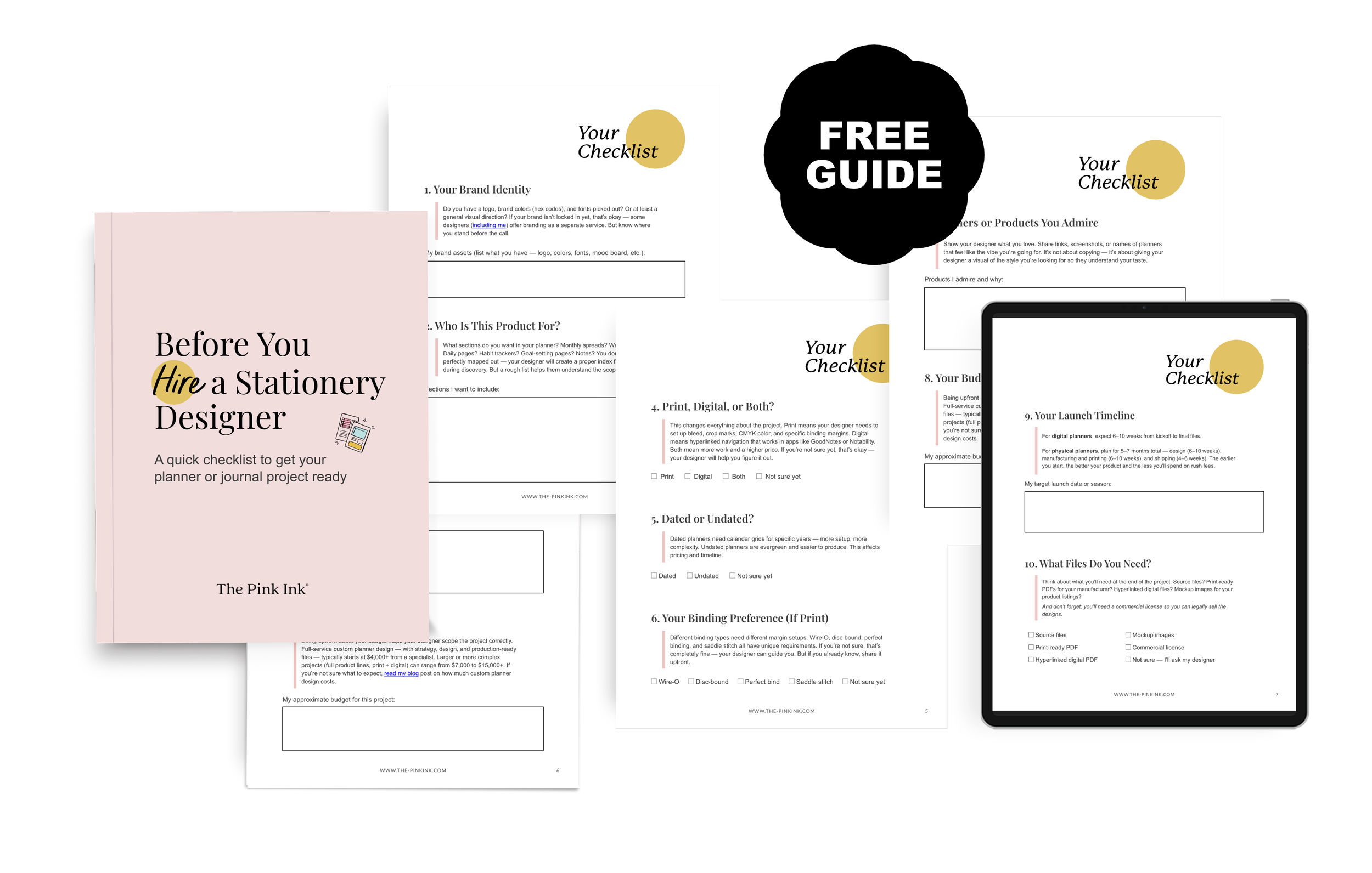
My free checklist helps you organize everything before that first designer conversation. Download the free checklist →