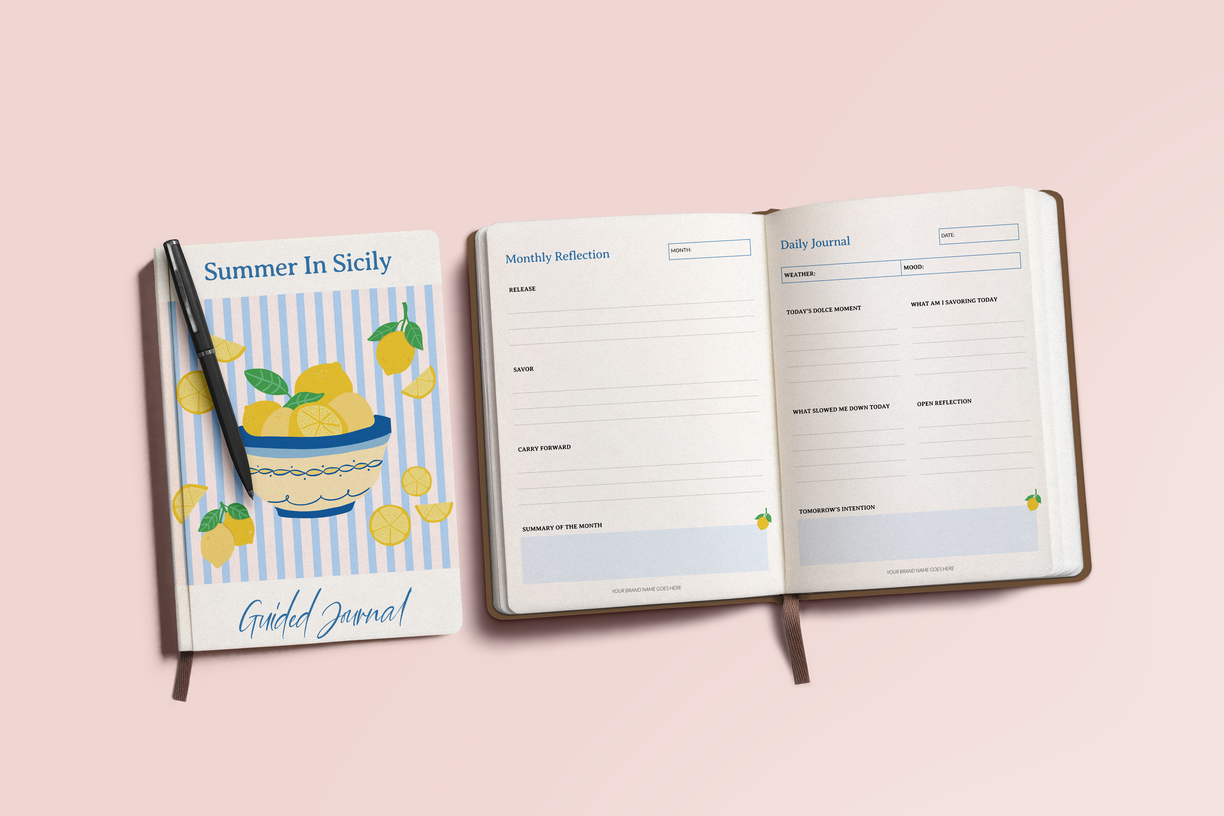
You've poured months into creating your planner. You carefully designed the pages, refined the details, and made sure it looked beautiful before launching it to the world. You shared it on Instagram, emailed your list, and maybe even invested in ads, expecting the sales to follow.
Instead, you're left wondering why the response wasn't what you hoped for.
I know just how frustrating of a situation that can be, especially when it seems like similar planners are doing well. So the question is, if the design looks good, what’s the difference?
After working with stationery brands for years, I've found that it's almost never because a planner isn't pretty enough. More often, the problem comes down to one of three things: a design issue (the planner doesn't work for your customer the way it needs to), a strategy issue (the right people aren't finding it, or the wrong people are), or a format issue (it's not built in the way your market needs).
Let's walk through each one so you can identify what may be holding your planner back—and, more importantly, what you can do to fix it.
A Beautiful Planner Doesn't Always Make a Better Planner
Let’s break down some of the most common issues that often go overlooked because they’re difficult to spot on screen and may only be noticed by your customers when they’re trying to write in your planner.
Cramped layouts. A planner that has stunning headers and decorative elements may look great, but if it only has three lines of writing space per day, then it’s not functional. Aesthetics are only one small part of the reason why people buy planners. More importantly, they buy products because they work. If there isn’t enough room to actually write, nothing else matters.
Poor page flow. The monthly spreads are in one section, then your user comes across a random goals page, and then back to monthly spreads. Your customer gets confused about where things are and what comes next. Pages need to flow logically so that the structure should feel intuitive and doesn’t need instructions.
No visual hierarchy. Everything on every page looks the same importance-wise. Titles, dates, headers, and body content all blend together. Without hierarchy, even a well-organized planner feels disorganized and your user is left feeling confused.
Generic template vibes. Customers can tell when a product hasn’t been customized to fit their needs. Your planner needs a point of view past just chasing trends. The best planners feel like they came from a specific brand instead of an unedited template.
Inconsistent branding. Your cover is one style, but the interior is another. Typography shifts page to page. Colors drift. A cohesive planner feels intentional — with every page looking like it belongs with the others.
DOWNLOAD THE CHECKLIST »
The Right People Aren’t Finding Your Planner
This is even harder to spot than design issues, but they’re probably the bigger reason why your planner isn’t selling. Here’s the top four reasons the right people may not be discovering your planner:
No clear audience. Your planner is “for everyone who wants to stay organized.” That sounds reasonable, but it means no one reads your product listing and thinks “this was made for me.” A planner “for freelancers who juggle multiple clients” is more compelling than a planner “for anyone.” The more specific a planner is, the more someone feels like it’s made for them.
Wrong price point. Maybe you priced your planner at $15 because you wanted to make it affordable. Or maybe you priced it at $45 because you knew how much work went into creating it. The problem is that pricing isn't just about your costs or what feels fair—it's about what your customers expect to get for that price. If the price and the value don't feel aligned, people are much less likely to buy.
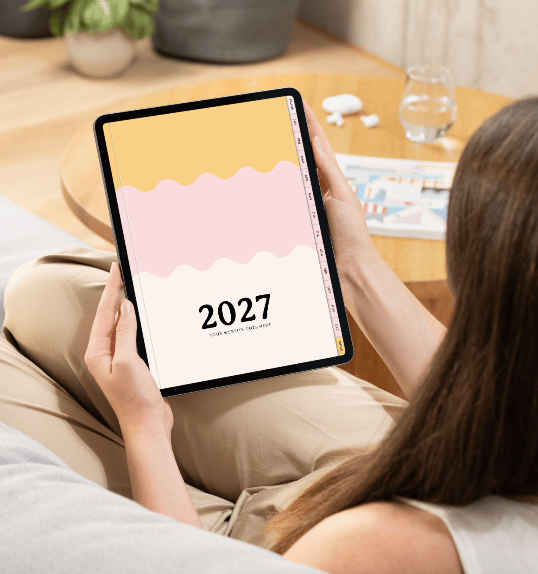
Weak product presentation. Even the most beautifully designed planner can be overlooked if your photos don't show it at its best. One flat-lay image usually isn't enough. Your customers want to see the planner open and closed, close-up details of the pages, and how it looks in real life—whether that's on a desk, in someone's hands, or on an iPad. The easier it is for them to picture themselves using it, the more confident they'll feel about buying it.
No differentiation. You looked at what was already selling and made something similar. But why would someone buy your version instead of the one that’s already established? There has to be something — a unique structure, a specific audience, a design point of view — that makes someone choose you.
You Built the Right Product in the Wrong Format
Sometimes the design is strong and the strategy is solid, but there’s a disconnect between the product format and what your audience actually wants.
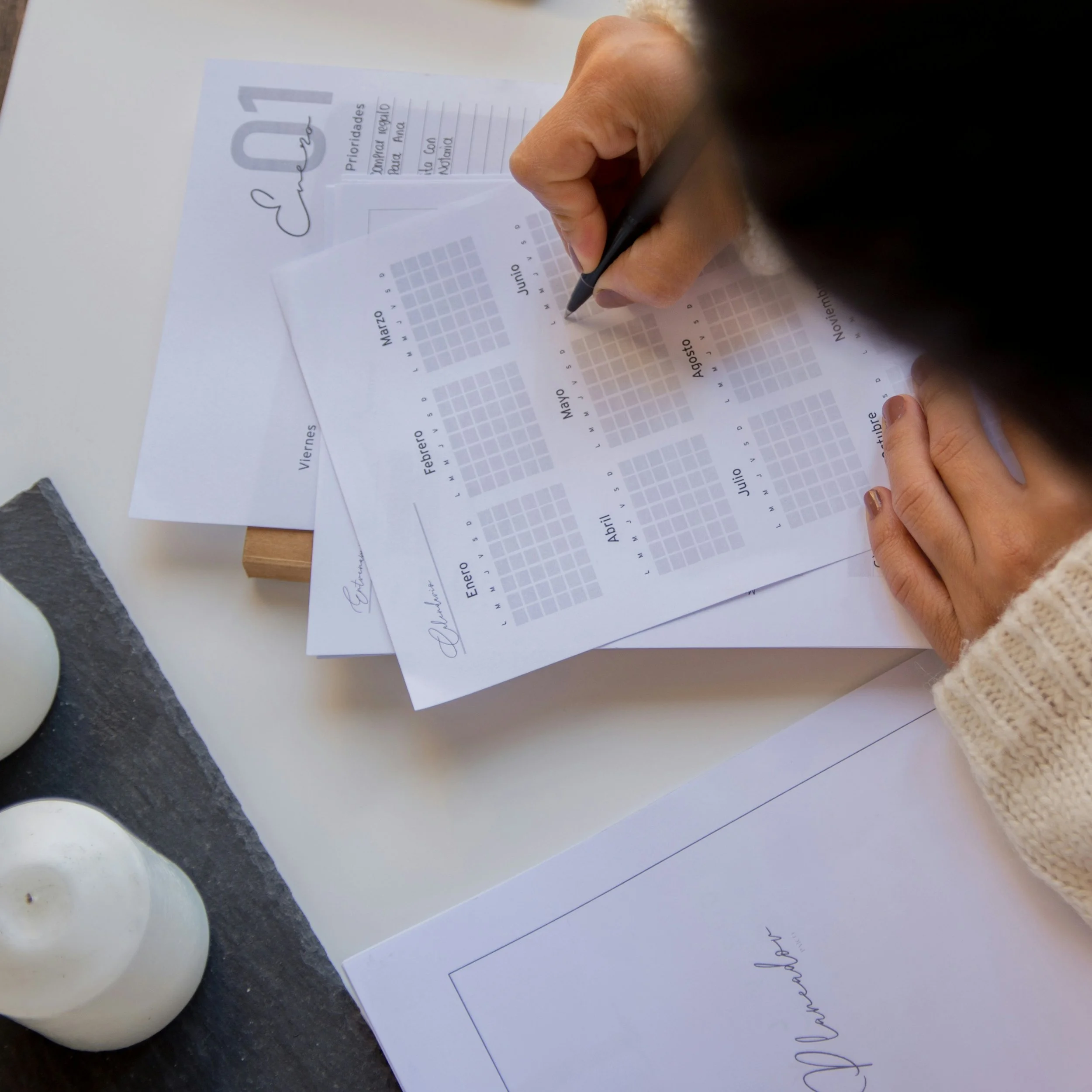
Print when they want digital. You spent months creating a beautiful bound planner, only to discover your ideal customer plans on her iPad. Or the reverse — you made a digital planner but your audience loves physical products they can hold.
Wrong size. The best planner size depends on how your customers will actually use it. Some people want something compact they can carry everywhere, while others need plenty of room to write at their desk. Before choosing a size, think about your customer's daily routine, not just what looks best.
Binding that doesn’t fit the planner's use. Your binding plays a bigger role than you might think because it affects how your customers interact with the planner every day. For example, Wire-O binding lays flat and works well for daily planning, while perfect binding offers a more polished look but doesn't stay open as easily. As you compare your options, think about how your customers will actually use the planner and choose the binding that best supports that experience.
💌 Interested in working with The Pink Ink to create your custom planner or journal?
Fill out an inquiry form to start the conversation, share your project details, and help me determine if we’re a good fit for each other.

What to Do Before You Redesign
If your planner isn't selling as well as you'd hoped, don't assume you need to start from scratch. Sometimes a few thoughtful changes are all it takes to create a better experience for your customers and a stronger product overall.
Start by taking a step back and looking at the bigger picture. Who is your planner designed for? What problem does it solve? And does every design decision support that purpose? Once you have those answers, you'll be in a much better position to decide what needs to change.
Whether you update your strategy, refine the design, or make a few adjustments to the format, every improvement brings you one step closer to creating a planner your customers will love to use.
Ready to Fix It?
I work with stationery brand owners at every stage of this process:
→ Need a strategic redesign? My custom planner design service doesn’t start with design — it starts with strategy. We’ll figure out who your planner is for and what problem it solves before we touch a single layout.
→ Want to start fresh with professional foundations? My PLR membership gives you designer-quality templates built for customization. Bring your brand — your colors, your illustrations, your audience understanding — and build products that stand apart.
→ Not sure your branding is strong enough? My custom branding service builds your visual identity first — logo, color palette, fonts, brand guide — so everything you create going forwards feels cohesive and unmistakably yours.
→ Just need clarity? Book a 1:1 Clarity Call and let’s talk through what’s holding your planner back and what to prioritize first.
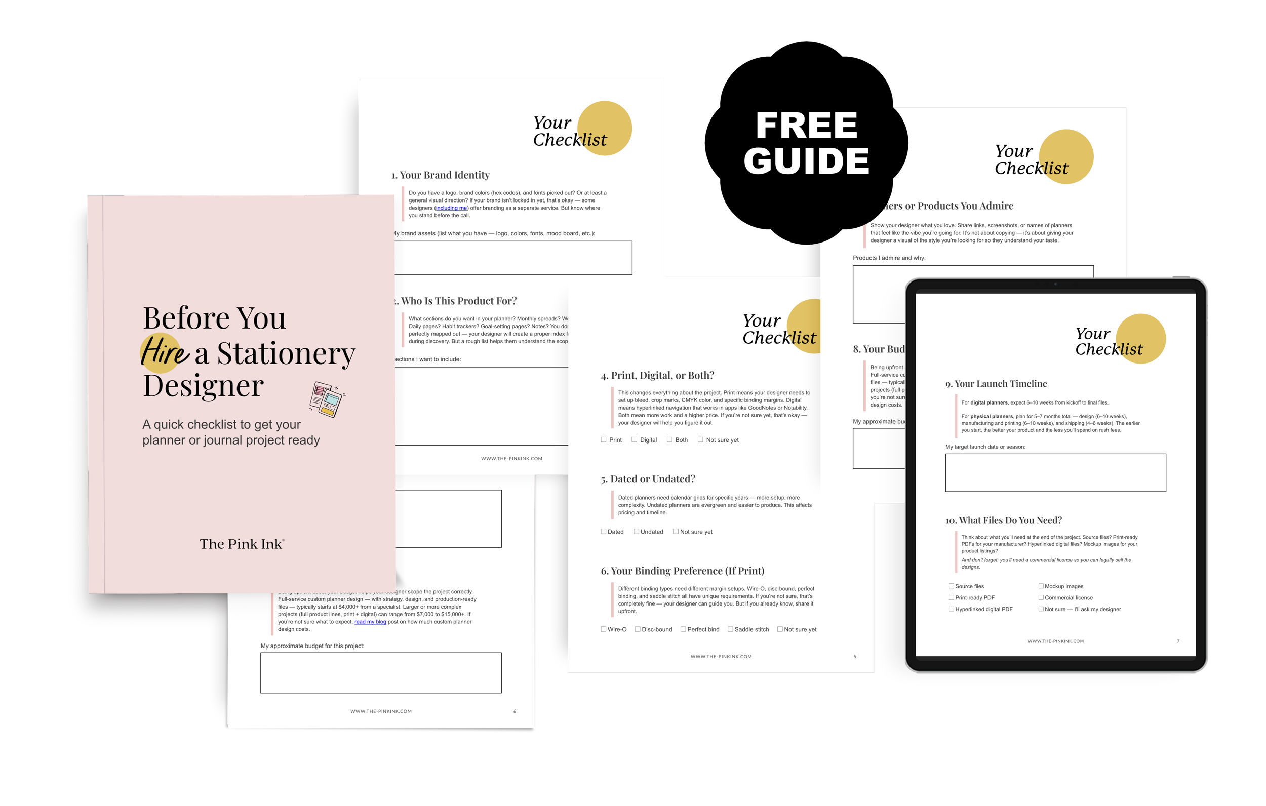
Not quite ready to hire? My free checklist helps you organize everything before that first designer conversation. Download the free checklist →