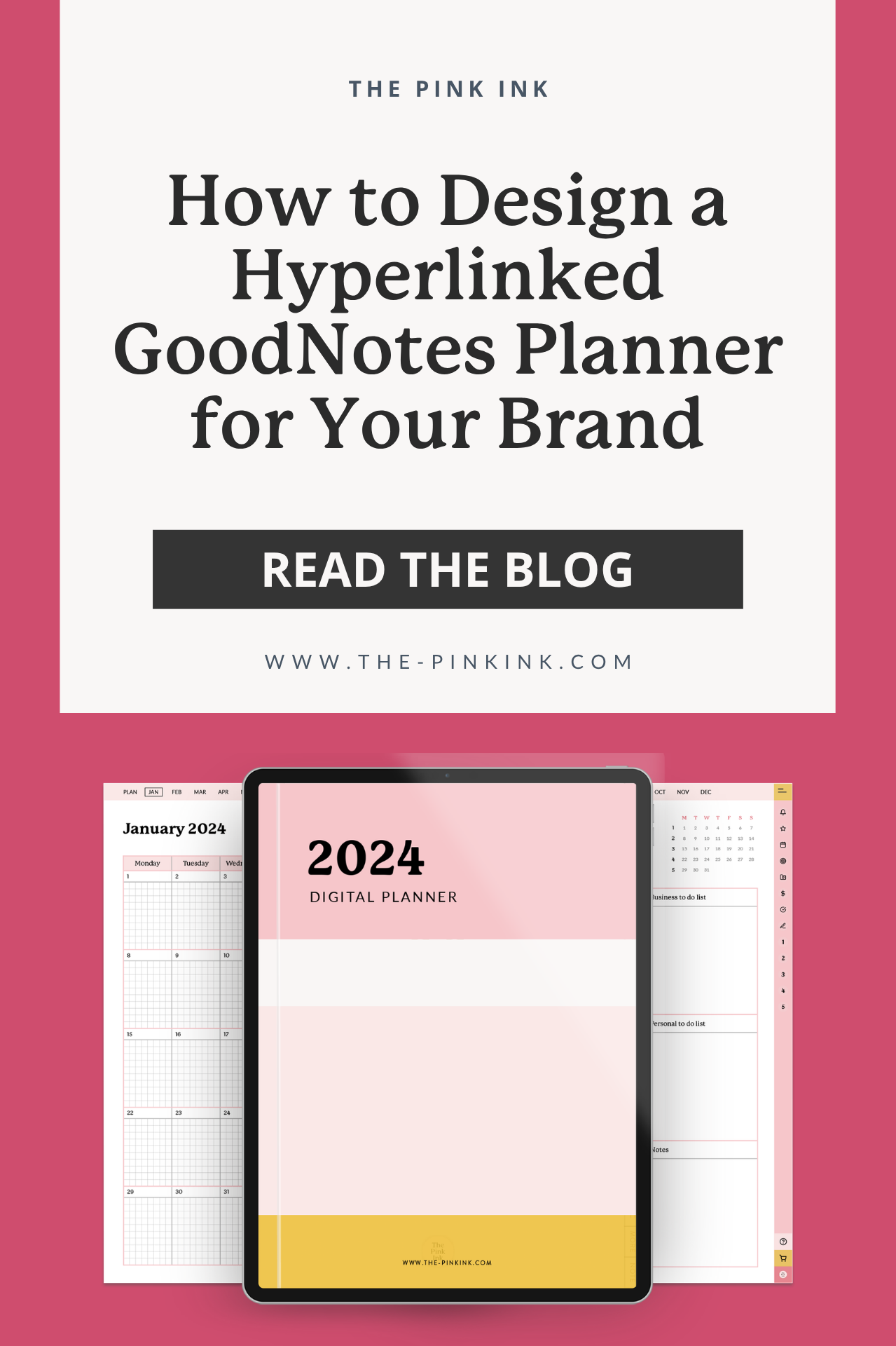
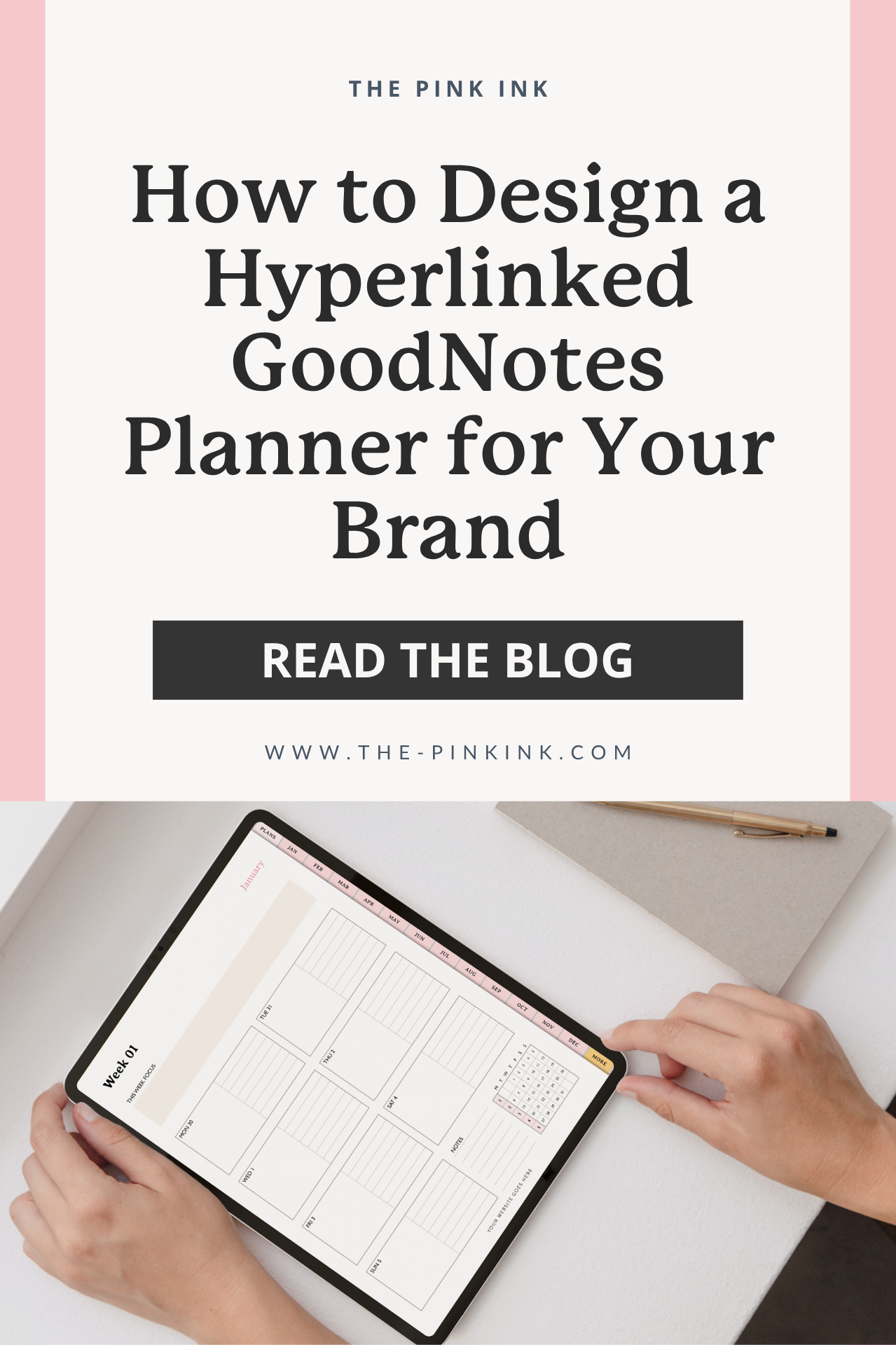
How to Design a Hyperlinked GoodNotes Planner for Your Brand
Digital planners have gone from a niche hobby to mainstream products — and GoodNotes is one of the biggest influencing platforms. If you're a stationery brand thinking about launching a digital product, a hyperlinked planner design is one of the best ways to deliver real value to your audience.
But here's the thing: designing a great digital planner isn't the same as designing a great print planner. The way your planner will be used changes everything. Let me walk you through what it takes to create a custom digital planner that feels professional, intuitive, and on-brand.
What Makes a GoodNotes Planner Different
In a printed planner, people flip pages. In GoodNotes, they tap. It seems like a small difference at first, but it completely changes the way a thoughtful digital planner needs to be designed.
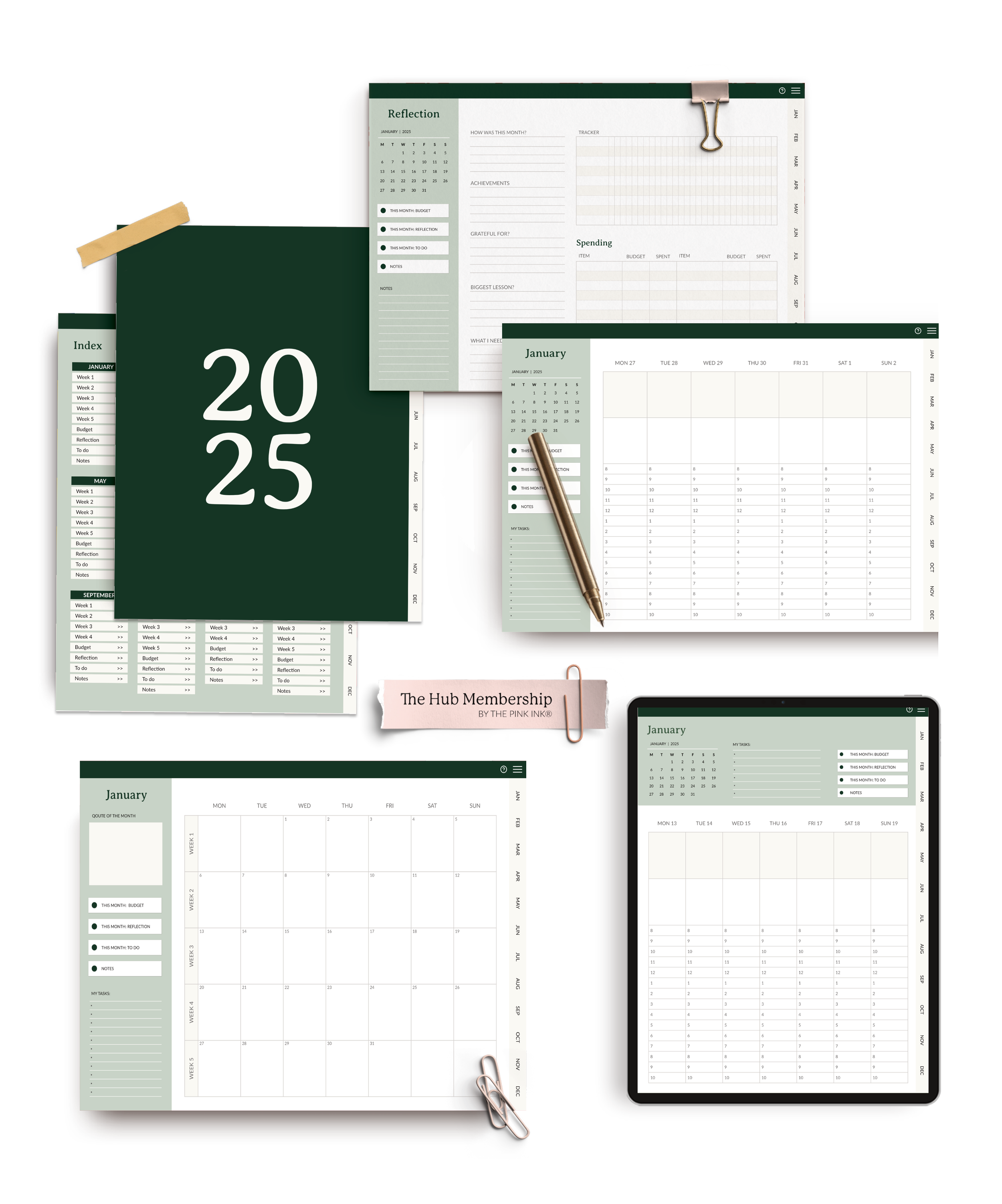
A well-designed GoodNotes planner includes:
Clickable tabs that let users jump between sections instantly
Hyperlinked navigation on every single page so users never feel lost
A consistent layout structure that works on iPad screens
Interactive elements like linked buttons, section dividers, and index pages
The goal is to make it feel effortless. Your customer should be able to tap from their monthly overview to a specific week to a daily page — and back again — without it feeling complicated.
Start with Structure, Not Aesthetics
It can be easy to get excited and start designing beautiful individual pages before figuring out how you’re going to link everything together. I’ve been there before, and every time I did that, I regretted it. The result?
Instead, start with a content map. In my process, this is the index file stage — I map out every section, every page type, and every repeat count before touching any design software. For a digital planner, this map should also answer the following questions:
What sections does your planner need? (Monthly, weekly, daily, goals, notes, trackers?)
How does the user get from one section to another?
What navigation elements appear on every page?
How many total pages are you building?
This is the first step to complete before opening any design software. A spreadsheet or simple outline works great. This becomes the blueprint that keeps everything organized. (I go deep on this planning process in my custom planner design service — it's the same discovery and strategy phase whether the planner is print or digital. Learn more about it here →
📋 Before you start designing (or hiring someone to design), get your planner structure organized. My free checklist makes it easy. Download the free checklist →
💌 Interested in working with The PinkInk!
Fill out an inquiry form to start the conversation, share your project details, and help me determine if we’re a good fit for each other.
Designing for the Screen
GoodNotes planners are used on iPads, which means you're designing for a screen — not a printed page. It’s important to keep a few things to keep in mind:
Landscape format tends to work better. It gives you more room for side tabs and feels natural on an iPad.
Make tappable links and locations big enough that your users can tap easily with their fingers.Too small of an area and your users are going to get frustrated quickly!
Use color intentionally. Screens display color differently than print. What looks muted on paper might pop on a screen. Test your colors on an actual iPad.
Think about both visual quality and usability. PDF files at standard page size and 150 DPI often provide the right balance between quality design and manageable file size.
A great digital planner experience is usually built through thoughtful details. Easy navigation, comfortable spacing, and colors that work well on screen all contribute to a product that’s enjoyable to use.
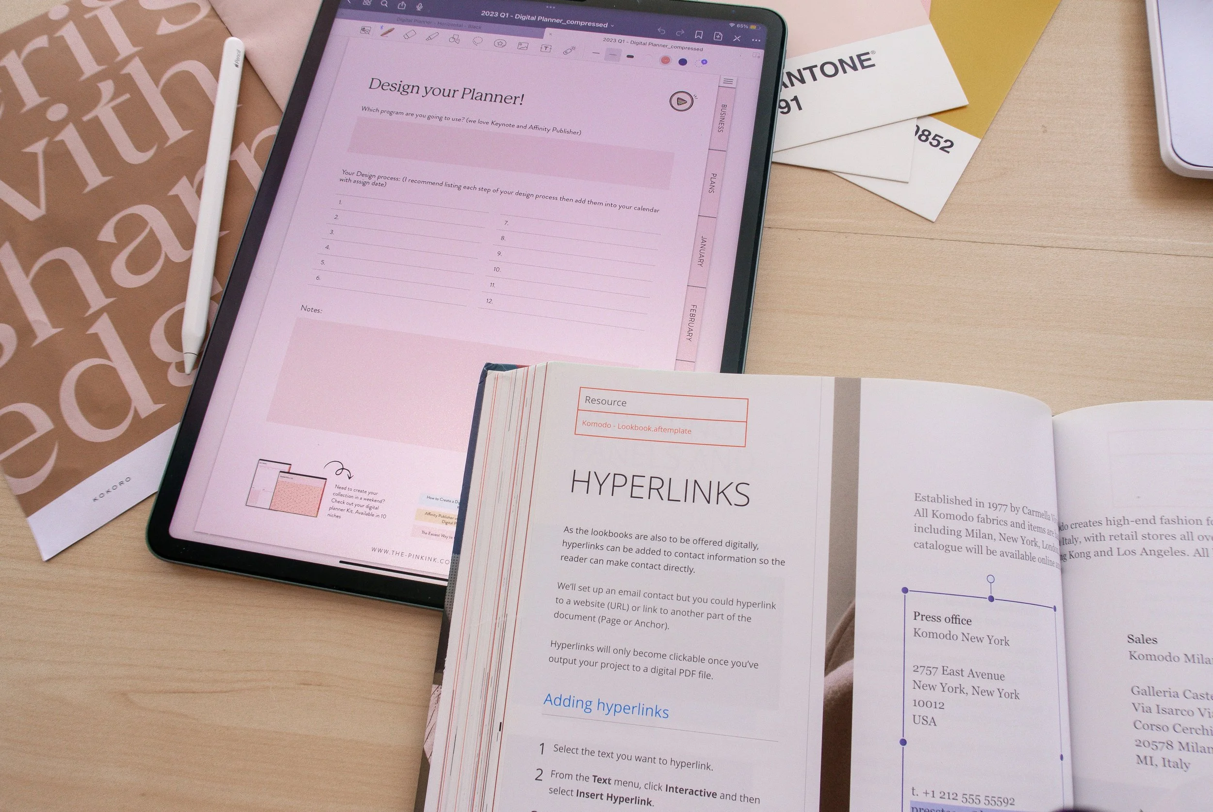
Building the Hyperlinks
This might be the most technical part of building a digital planner, but it can also be the most rewarding.
A good hyperlinking strategy typically goes unnoticed, because it works that well. Every tab, clickable button, and linked page is intentionally connected to help the planner feel smooth and easy to navigate for the customer. Here’s a look at how it all comes together:
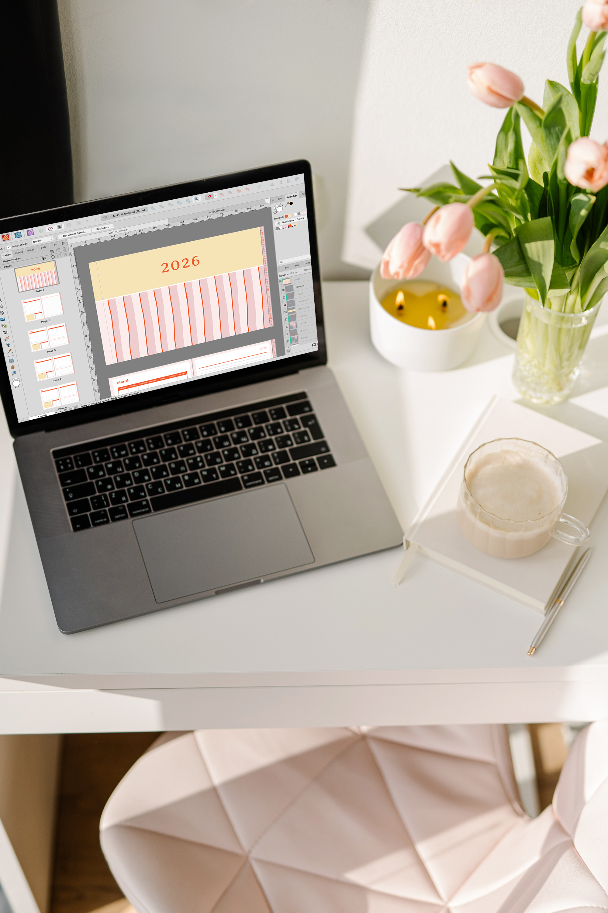
Design your pages in a tool like InDesign, Affinity Publisher, or Keynote (for simpler planners)
Set up clickable regions that link to specific pages within the document
Test every single link (yes, every single one). My favorite way to do this is by testing the actual planner in GoodNotes, using my iPad.
Export as PDF with hyperlinks preserved. Not all export settings keep links intact, so be sure to double check your settings!
One of the most important parts of the process is carefully testing the planner before it ever reaches a customer. This helps make sure the navigation feels intuitive and the hyperlinks function smoothly. Here are a few common things designers typically look for during testing:
Hyperlinks that function smoothly across different devices and operating systems, since navigation can sometimes behave differently depending on how the PDF is being opened.
Buttons that feel comfortable and responsive to tap on an iPad screen, not just visually balanced on the page itself.
They double-check that navigation flows intuitively from section to section so customers can move through the planner naturally without getting lost or confused.
Optimized file size so that the planner still feels fast, smooth, and enjoyable to use inside apps like GoodNotes, even with extensive hyperlinking and design elements.
If you’re thinking that this sounds like a lot of work, you’re right. That time commitment and the attention to detail required is one of the biggest reasons brands hire me to handle their planner design. You can learn more about what’s involved in working with a designer and how to prepare for your project by downloading this free checklist!
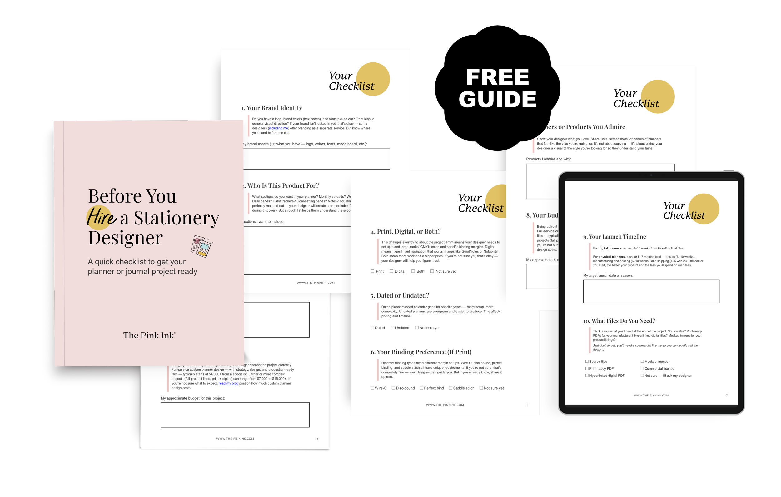
DOWNLOAD THE CHECKLIST »
Making It Feel On-Brand
Your digital planner should feel like a natural extension of your brand identity. That means:
Your brand colors, fonts, and graphic style carry through every page
The cover design matches the quality of your other products
Text or prompts are written in your brand voice
Custom illustrations or icons are consistent throughout
One of my favorite parts of digital planners is that you can play around with color and detail more than you can with printed products. Don’t be afraid to explore different options!
Keeping a digital planner feeling consistent across hundreds of pages is a behind-the-scenes detail that makes a big difference. A 100-page planner might only have 20–30 core layouts — monthly spreads, weekly pages, trackers, dashboards, covers — but those layouts repeat again and again throughout the product.
That’s why custom digital planners are usually built with structured master templates behind the scenes. Keeping fonts, spacing, colors, alignment, and layout details consistent across every section helps create a smoother customer experience while also making the overall brand feel more refined and recognizable from beginning to end.
Testing on an Actual iPad
One of the biggest parts of creating a smooth digital planner experience happens during testing — especially on the actual device and inside the actual app your customers will be using. A layout that feels spacious and easy to navigate on a large computer monitor can feel completely different once it’s opened on an iPad inside GoodNotes or Notability.
Things like button placement, tab sizing, screen angles, and natural hand movement all shape how comfortable the planner feels to use in real life. A digital planner can look beautiful visually, but the experience becomes much more enjoyable when the navigation also feels intuitive and effortless for the customer.
That’s why testing directly on an iPad is such an important part of the process. Small adjustments to button sizing, navigation flow, spacing, or layout placement can make a huge difference in how seamless the planner feels. In many ways, intuitive digital planner design comes less from how something looks on a screen and more from how naturally it functions once someone is actually using it.

Common Mistakes to Avoid
After years of digital planner projects, here’s what I would advise against doing:
Overcrowding pages. Screens feel smaller than print pages, so give your elements room to breathe!
Inconsistent navigation. If your "back to monthly" button is in different spots on different pages, users might get confused.
Ignoring file size. A planner with high-res images on every page becomes a huge file that lags in GoodNotes. Optimize your assets!
Not testing on an actual iPad. What looks great on your computer monitor might not translate, so don’t forget to test in the real app.
Skipping the user guide. Including a simple first page explaining how the navigation works can help beginner planners move through your product confidently.
What "Intuitive Navigation" Actually Means
When I say a digital planner should feel intuitive, I mean:
Your customer can find what they're looking for in 2-3 taps
The navigation structure matches how they naturally expect to move through the planner (for example: monthly → weekly → daily)
Every page has a clear way back to a main menu or table of contents
Tappable elements are large enough that they can be hit without zooming in or squinting
The file doesn't lag or take 5 seconds to flip between pages
A lot of what makes a digital planner feel polished comes down to the user experience behind the scenes. It’s not just about creating something that looks beautiful in a mockup — it’s about designing something that feels smooth, intuitive, and enjoyable to use on an actual iPad. Things like tap-friendly icons, easy-to-follow navigation, and optimized file sizes all shape how the planner functions day to day. Small adjustments to button sizing, navigation flow, and file organization can make a huge difference in creating a planner experience that feels seamless for the customer from the very first tap.
Should You DIY or Hire a GoodNotes Planner Designer?
If you're a designer yourself and enjoy the technical side, you can absolutely build a GoodNotes planner on your own. My step-by-step guide and workflow tips will help.
If you're a brand owner who wants to focus on your business, hiring a specialist makes a lot of sense. A dedicated GoodNotes planner designer knows the technical requirements, can build and test hyperlinks efficiently, and understands how to optimize the product for the best user experience.
Either way, approach digital planner design as product design, not just graphic design. Your customers are buying a tool they'll use every day — make sure it works as beautifully as it looks.
📋 Leaning toward hiring a specialist? This checklist covers everything you should have ready before that first conversation. Download the free checklist →
I design hyperlinked digital planners for stationery brands. If you want a GoodNotes planner that's beautiful, functional, and on-brand, I'd love to help. Let's talk about your project →
Or if you're exploring options, check out my unlimited design membership— it covers digital planners, print products, and everything in between. One designer, all your needs.